- sounds. Especially annoying clapping/cheering sounds, or a different sound for each slide transition.
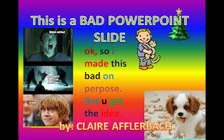
- pictures and colors. I believe PowerPoints should have a theme. And that theme should not be "Rainbow Throw-up."
- sparkly effects. It hurts my eyes, stop it.
- moving sh--, stuff. If every single image or item of text comes crawling in a snail's pace while your audience tries not to fall asleep, this may indicate that your PowerPoint sucks (or your topic is really boring).
- slide transitions. Yes, they were fun to play with in middle school. They're not so fun now.
However, PowerPoints don't have to be bad. In fact, most PowerPoints can actually be very useful tools for conveying information. I find them particularly helpful when trying to take notes in class - if I miss something the teacher says, I can always go back and look at the PowerPoint, which can help jog my memory. There are a couple simple rules (and suggestions) that can help make sure your PowerPoints aren't awful. First off, limit text to bullet point-style notes, and don't just read them when presenting. And please, check your spelling and grammar to avoid an unreasonable number of mistakes. My biggest tip to making professional looking PowerPoints is simple - use the pre-programmed themes and slide designs that PowerPoint already has. And if you are going to create your own theme, then be fairly conservative and simple. Anything too complicated can subtract from the information you are trying to share.

I love your visual aid! Its very effective!
ReplyDeleteI listed some of the same things! I agree that it is very annoying when the powerpoint is really bright with different fonts and colors
ReplyDeleteHaha, love the example, that's great. We definitely agree on most of those points.
ReplyDelete